IELTS Report 7 – Pie Chart – Changes in Annual Spending
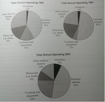
The three pie charts below show the changes in annual spending by a particular UK school in 1981, 1991 and 2001.
Summarise the information by selecting and reporting the main features, and make comparisons where relevant.


The three pie charts represent the proportion of yearly expenditures of a specific UK school in 1981, 1991 and 2001. It is immediately apparent that the majority of expenditures among the three years belonged to teachers’ salaries, while the least spending was recorded by insurance.
In 1981, the spending on teachers’ wages was 40% followed by a growth to 50% in 1991, and witnessed a slight decline to 45 percent in 2001.
It was merely 2% of expenditure on insurance in 1981, slightly increased to 3% in 1991, whereas the consumption skyrocketed to four times larger, 8% in comparison with 1981 in 2001. However, the proportion of money spent on other workers’ salaries had been falling during the periods, started at 28% in 1981 and decreased to 22% in 1991, eventually became nearly half of that of 1981 in 2001(15%).
The spending on resources and furniture and equipment showed the opposite trends, which were the same at 15% each in 1981. The first one gained by 5% to 20% in ten-year period and became almost halved(9%) in 2001, while the latter one first fell to one-third of that of 1981 in 1991 and surged to a high of 23% finally.


