

This IELTS Task 1 guide covers the important tips and sample answers for combined table and pie chart questions found in IELTS writing task 1. Let’s start preparation with Benchmark IELTS!
Table of Contents
- IELTS Table and Pie Chart Overview
- IELTS Task 1 Combined Table and Pie Chart Question
- Structure for IELTS Table and Pie Chart Questions
- IELTS Writing Task 1 Band Descriptors Explained
- Vocabulary for IELTS Tables and Pie Charts
- Grammar for IELTS Writing Task 1 Tables and Pie Charts
- IELTS Writing Task 1 Table and Pie Chart Sample Answer
- Common Mistakes and How to Avoid Them
- Quiz- Check Your Understanding
1. IELTS Combined Table and Pie Chart Overview
Another type of combination question you might find in IELTS writing task 1 is a table and pie chart. You will need to write about both the table and pie chart in this question.
1.1 Objective
Your objective is to produce a 150-word formal report within 20 minutes that summarises the main features from both the table and chart.
1.2 Skills Used
You will need to show that you can select and summarise the key features of a table and pie chart and also make comparisons where relevant.
2. IELTS Task 1 Table and Pie Chart Question
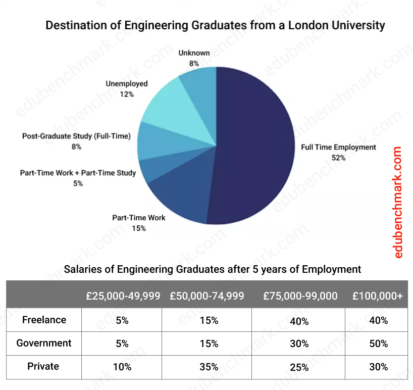
The chart below shows what Engineering graduates from a London university did after their undergraduate degree course. The table shows the salaries of the Engineers in work after five years.
Summarise the information by selecting and reporting the main features and make comparisons where relevant.
Write a minimum of 150 words


3. Structure for IELTS Table and Pie Chart Questions
The following paragraphs about an introduction, overview and main body paragraph will help you to produce a clear structure for a combined table and pie chart.
3.1 Introduction
A good introduction for an IELTS writing task 1 report will keep it simple: you only need to paraphrase the given statement in your own words. Make sure to introduce both the table and pie chart. Here are some example phrases to do this:
- The table gives information about…
- The pie chart illustrates
A successful paraphrase will not change every word, but it will use synonyms, change the sentence structure and/or word class to rephrase the statement whilst maintaining the same meaning. See this example below, can you spot the main changes?
Original statement:
The chart below shows what Engineering graduates from a London university did after their undergraduate degree course. The table shows the salaries of the Engineers in work after five years.
Paraphrased statement:
The pie chart illustrates the career path of Engineering students after graduating from a London university, while the table illustrates their salaries after working in the Engineering field for 5 years.
3.2 Overview
Your overview is essential if you want to score well in Task Achievement. You need to select the key features from both the table and the pie chart. The linker ‘Overall,’ is a nice clear indicator that this is your overview.
Identify the highest and lowest numbers, the biggest differences, or any changes over time. These will be known as the key features.
Do not go into detail by mentioning specific figures here, keep it more general and only go into detail in the main body paragraphs.
You should look to identify 4-6 features from both the table and the pie chart: any more and you will likely run out of time.
3.3 Main Body Paragraphs
Your structure should be clear and easy for the reader to follow. Consider using the following structure for your main body paragraphs:
Main Body Paragraph 1– The main features of the table
Main body paragraph 2– The main features of the pie chart and any comparisons with the pie chart itself or the table
Your main body paragraphs are where you go into detail about the trends from your overview. You need to use a range of grammatical structures and language to do this. You also need to be accurate when describing the data, so be careful as the examiner will check your report carefully to see if the figures match the table and pie chart.
4. IELTS Writing Task 1 Band Descriptors Explained
Check out our section on IELTS Writing Band descriptors in our IELTS writing Task 1 Masterclass for helpful hints.
5. Vocabulary for IELTS Tables and Pie Charts
5.1 Vocabulary for Tables
Linking devices are a way of creating cohesion throughout your report. You want to use a range of linking words (also called ‘cohesive devices’) when writing about tables, but make sure not to over-do it: only use them when appropriate.
Here are some useful examples:
- whereas
- while
- as opposed to
- compared to
Example Sentences:
5% of people worked as a freelancer, whereas/while 10% worked for private companies.
Only 5 % of people worked as a freelancer as opposed to/compared to 10% that worked for private companies.
Language for Reference
The words ‘respectively’ and ‘in turn’ are an efficient and accurate way to refer back to specific figures in your report and will help to enhance your score for Lexical Range and Accuracy.
Take a look at these example sentences:
The price of oil and gas in 1990 was almost the same (about $100 and $110, respectively).
Espressos were considerably less popular than espressos, at 4 and 8 sales per week in turn.
5.2 Vocabulary for Pie Charts
Since the data in pie charts is most often given using percent (%) then it is useful to use phrases that have the same meaning. This will help you to reduce repetition and increase your lexical range. Here are some examples
10% – A tenth / one in ten
20% – A fifth / one in five
25% – A quarter / one in four
33% – A third / one in three
50% – A half / half / one in two
66% – Two-thirds
75% – Three-quarters
6. Grammar for IELTS Writing Task 1 Tables and Pie Charts
6.1 Grammar for Tables
Here are some useful comparative structures to describe tables:
Form
X is as _____ as Y
X is not as _____ as Y
Examples:
Full-time employment was as common as part-time employment
Unemployment was not as common as proving the reason ‘other’.
6.2 Grammar for Pie Charts
Aim to use a range of comparative forms when describing the data in your pie chart. Here are some examples:
Comparatives:
Engineering was more popular than Accounting
English was slightly more popular than Science.
Superlatives
- The most popular subject was Economics…
- The least popular subject was Art and Design…
7. IELTS Writing Task 1 Table and Pie Chart Sample Answer
The chart below shows what Engineering graduates from a London university did after their undergraduate degree course. The table shows the salaries of the Engineers in work after five years.
Summarise the information by selecting and reporting the main features and make comparisons where relevant.
Write a minimum of 150 words


Sample
The pie chart illustrates the career path of Engineering students after graduating from a London university, while the table illustrates their salaries after working in the Engineering field for 5 years.
Overall, it can be seen from the pie chart that the majority of graduates continued on to full-time and part-time employment. Additionally, the highest salary for the Engineers came from government and freelance work.
Regarding the pie chart, it is clear that graduates who began full-time work accounted for just over half (52%) with those in part-time employment comprising less than a fifth (15%). Only a small number continued on to full-time post-graduate studies and part-time work, at 8% and 5% respectively. Just over a tenth of graduates did not find work and remained unemployed after graduation.
Looking at the table, the highest earners, of more than £100,000 annually, were those working in freelance and government positions at 40% and 50% in turn. In terms of private sector work, 35% of graduates earned £50,000 to £70,000 which was the highest figure in this category.
7.1 Sample Commentary
The report above would receive an estimated 9.0 overall in the IELTS writing task 1 Academic paper.
It has been organised into four logical paragraphs that are clearly divided into an introduction, overview, and two separate body paragraphs.
The overview refers to both the table and the pie chart. The linkers ‘overall’ and ‘additionally’ have been used appropriately.
Other linking phrases have been used throughout the report, for example ‘Looking at the table…’ and ‘In terms of….’
Since the data does not refer to a specific time, the report does not refer to any years throughout. However, since the students have already graduated, the writer has used the past tense as this event has finished.
The key features from the table and pie chart have been identified and summarised. Figures and percentages have been accurately referred to and repetition has been avoided by using a range of language to discuss the data e.g. ‘fifth (15%)’, ‘at 8% and 5% respectively’, ‘just over half (52%)’.
8. Common Errors and How to Avoid Them
8.1 Problem 1
Problem
Having difficulty reading the data from a table
Solution
Try to visualise how the data from the table would look as a graph. This may help you to identify the key trends.
8.2 Problem 2
Problem
Not referring to the units of the table and pie chart.
Solution
It is important to provide units when giving specific details. For example, if you are describing a pie chart, it is likely that the units are given in % and therefore you should mention % after a number.
9. Quiz- Check Your Understanding
Take this short quiz to test your understanding of writing task 1 table and pie chart questions.


