IELTS Report 15 – Line Graph – World Population Growth
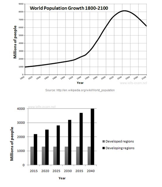
The graphs below provide information on global population figures and figures for urban populations in different world regions.
Summarise the information by selecting and reporting the main features, and make comparisons where relevant.


The line graph shows global population growth from 1800 to 2014, and projected change until 2100. The bar chart indicates the expected figures for population in cities in developed regions and developing regions.
From 1800 to 1920, it is obvious that the world population saw a gradual rise, growing from 1 billion to 2 billion. After that, it began to rise considerably, increasing by one billion in only 40 years. From 1960, there was a sharp growth in population, arriving at around 7 billion in 2014. It is predicted that the world population will continue to increase, peaking at about 8.1 billion by 2045. This will be followed by a significant decline to just above 6 billion in 2100.
As can be seen in the bar chart, the population in developed regions is anticipated to remain stable at around 1.3 billion between 2015 and 2040. Over the same period, however, developing regions are projected to experience a substantial growth in population, rising from approximately 2.2 billion to 4 billion.
Overall, the global population has changed continuously since 1800 and the change in the near future is mainly due to the growth of population in developing regions.


