IELTS Report 5 – Bar Graph – Computer Ownership
The graphs below give information about computer ownership as a percentage of the
population between 2002 and 2010, and by level of education for the years 2002 and
2010.
Summarise the information by selecting and reporting the main features, and make
comparisons where relevant.
Write at least 150 words.


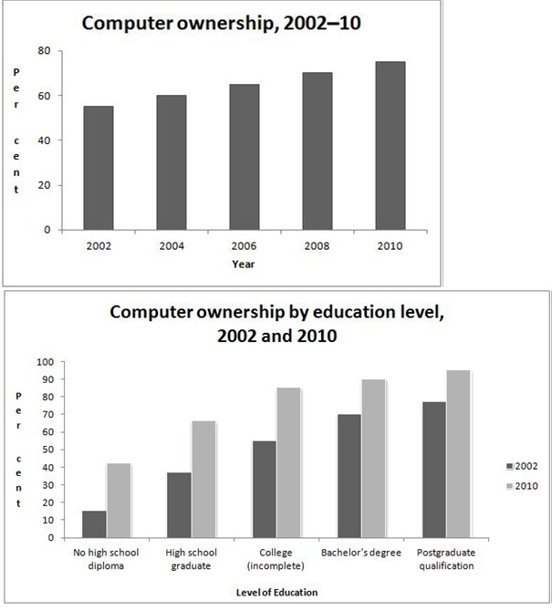
The first graph above shows information regarding computer ownership as a percentage of the population between the years 2002 and 2010. The second graph shows the percentage of computer ownership in 2002 and 2010 by level of education.
From the year 2002 to 2010, the percentage of the population who owned computers had increased steadily. It started at approximately 55% in 2002, and ended at approximately 70% in 2010.
This steady upward trend is also present in the second graph. In the year 2002, the percentage of computer ownership increased quite steadily as the level of education increased. Individuals with a postgraduate qualification had the highest percentage of computer ownership, while individuals without a high school diploma experienced the lowest percentage of computer ownership. The year 2010 depicted a very similar correlation between the percentages of computer ownership and the individual’s education level. However, all the figures in 2010 were higher than the figures presented in the year 2002.
In conclusion, the percentage of the population who owned a computer rose gradually between the years 2002 and 2010. In addition, there was also a positive relationship between computer ownership and education level, in both the years 2002 and 2010.


The given bar graph illustrate the percentage of computer ownership from the year 2002 to 2010 both by comparison of total population and education level.
It can be witnessed that,the computer ownership increased over the years and this ownership among the people with higher studies was higher than others.
According to the first graph,more than 50% people owned computer in 2002 and this percentage was kept on increasing over years.After six years the percentage of people who owned computer reached to over 70%.
Regarding with the second graph,it is crystal clear the percentage of computer ownership increased with the education level.For instance,a small minority (15%) of the people who had no high school diploma owned computer in 2002 and this percentage were about 60% for college (incomplete) individuals . similarly over 60% and 70% were for bachelor’s degree holder and post graduate qualifications.After 8 years in 2010 the same trend was observed.For instance about 45% reached no high school diploma and post graduate qualification reached over the 80%