
One of the difficulties of IELTS writing Task 1 is coming up with the right vocabulary to describe graphs and charts. In this article, I will explain how you can do that effectively and provide some examples.
Table of Contents
Purpose of the Test
Most importantly, you need to know what the purpose of this test is. The reason you are asked to describe a graph or chart is to show that you can use written English to clearly convey information, and that means you need to describe different things accurately.
The biggest challenge and the most important part of the test is talking about trends and making comparisons. Those are clearly stated in every Task 1 question, so you cannot overlook them.
Describing Line Graph Changes
First of all, you need the necessary language to describe line graph changes:
- rise / increase / grow
- fall / decrease / drop / decline
- stay stable / remain flat
- fluctuate / peak / plateau
It’s very important to know all of these words and others that describe similar changes over time. These mostly occur with line graphs but sometimes you can use them with bar charts, tables, and other sorts of data.
Modifying Vocabulary for Trends
It’s handy to know how to modify these words as well. For example:
- rise sharply / a sharp rise
- increase suddenly / a sudden increase
- decrease rapidly / a rapid decrease
Here we can see that we use VERB + ADVERB to modify a trend and also ADJECTIVE + NOUN.
Words That Cannot Be Modified
Note that certain words cannot be modified with the use of adjectives and adverbs. Those are words that reflect set trends, such as:
- stay stable / remain flat
Also, it includes words that refer to definite things (i.e. the meaning is already included in the word). For example:
- plummet
- rocket
- soar
Each of these words means to go up or down at a certain rate, so adding extra words to modify them is not possible.
Describing Static Data in Bar Charts
Most of what we’ve looked at so far describes changes over time, but in bar charts you often have differences that exist at one given time. This requires a different language. Here, we should highlight highs, lows, and differences:
- more than / higher than / highest / largest
- lower than / less than / lowest / smallest
- half of / a fraction of / a quarter of
- double / twice as much as
- compared to / by comparison
Examples for Comparing Data
This is where the language gets tricky because most people know these words but don’t know how to use them, and that’s very important because if you use them wrongly then you will lose marks.
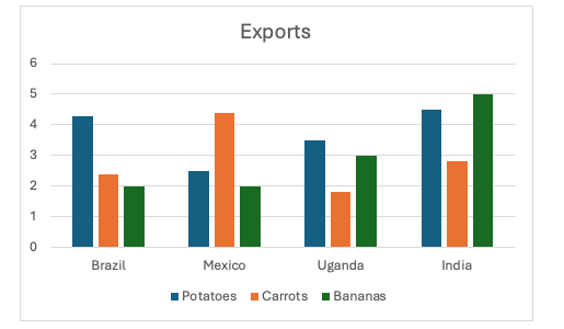
For example, let’s say we need to describe the following part of a bar chart:


We need to find parts of the chart to compare. We can compare countries or the things those countries exported. Let’s take Brazil as an example, and look at the difference between potatoes and bananas.
- Brazil exported more than twice as many potatoes as it did bananas.
- The volume of potatoes exported by Brazil was twice that of bananas.
- Brazil exported half as many bananas as it did potatoes.
- The figure for potatoes was double that of bananas.
As you can see, there are quite a few ways of expressing this single idea and that’s an important thing to understand when you prepare for IELTS writing Task 1.
Highlighting Highs and Lows
We also need to highlight points of interest here, meaning figures that are exceptionally high or low:
- India exported more bananas than any of the other countries listed.
- Uganda exported fewer carrots than any of the other countries listed.
- The volume of carrots exported by Mexico was significantly higher than that of any other country.
Here, we can see key data points listed and given using specific language that helps the reader to understand.
Countable vs Uncountable Data
Always keep in mind what you are describing and think about whether that is countable or uncountable. If you are describing volume, you would say “twice as much” but if you were describing individual items, you would say “twice as many.”
Grammar & Terminology Considerations
Other considerations when it comes to writing a Task 1 report include turning labels and headings into proper English. Note that I did not use capital letters above when writing about “carrots” and “bananas,” even though they were capitalised in the chart. That’s because charts use special non-grammatical language and part of your job is to change it into proper grammar to give a real description of the data.
Likewise, you may sometimes have to convert country names into adjectives. It was not appropriate above, but oftentimes when you see “Japan” listed, for example, you might need to say “the Japanese” or “Japanese businesses,” depending on the situation.
| Vocabulary | Application | Example Sentence |
|---|---|---|
| rise | Describing an upward trend | The number of tourists rose steadily from 2010 to 2015. |
| increase | Describing an upward trend | There was a 10 % increase in car ownership over the decade. |
| grow | Describing an upward trend | The city’s population grew by 5 % in 2018. |
| fall | Describing a downward trend | Oil prices fell sharply in 2020. |
| decrease | Describing a downward trend | Unemployment decreased slightly last year. |
| drop | Describing a downward trend | There was a drop in retail sales during the winter months. |
| decline | Describing a downward trend | The birth rate declined gradually between 2005 and 2015. |
| stay stable | Describing no significant change | Between 2012 and 2016, the exchange rate stayed stable. |
| remain flat | Describing no significant change | Profit margins remained flat throughout Q2. |
| fluctuate | Describing variable movement | Exchange rates fluctuated significantly over the year. |
| peak | Describing a high point | Crime rates peaked in 2008 before declining. |
| plateau | Describing a leveling off | After rapid growth, sales plateaued in the final quarter. |
| rise sharply | Modifying an upward trend | Housing prices rose sharply after the new policy was announced. |
| a sharp rise | Modifying an upward trend | There was a sharp rise in electricity consumption during summer. |
| increase suddenly | Modifying an upward trend | Demand increased suddenly following the product launch. |
| a sudden increase | Modifying an upward trend | The chart shows a sudden increase in visitor numbers in June. |
| decrease rapidly | Modifying a downward trend | The stock value decreased rapidly after the earnings report. |
| a rapid decrease | Modifying a downward trend | There was a rapid decrease in water usage during the drought. |
| plummet | Strong downward movement (cannot modify) | Temperatures plummeted overnight, causing frost. |
| rocket | Strong upward movement (cannot modify) | The cost of living has rocketed in recent years. |
| soar | Strong upward movement (cannot modify) | Profits soared after the marketing campaign. |
| more than | Static comparison in bar charts | Exports of tea were more than those of coffee. |
| higher than | Static comparison in bar charts | Car production was higher than that of trucks. |
| highest | Static comparison in bar charts | Germany had the highest export volume among the countries listed. |
| largest | Static comparison in bar charts | China accounted for the largest share of the market. |
| lower than | Static comparison in bar charts | The consumption of sugar was lower than fats in 2019. |
| less than | Static comparison in bar charts | Oil consumption was less than gas consumption in 2020. |
| lowest | Static comparison in bar charts | The UK had the lowest unemployment rate that year. |
| smallest | Static comparison in bar charts | Australia represented the smallest segment of the market. |
| half of | Proportional comparison | Demand for trains was half of what it was for buses. |
| a fraction of | Proportional comparison | Retail sales were only a fraction of wholesale figures. |
| a quarter of | Proportional comparison | Only a quarter of students achieved a distinction. |
| double | Multiplicative comparison | Car production was double that of trucks. |
| twice as much as | Multiplicative comparison (uncountable) | Water usage was twice as much as electricity consumption. |
| twice as many | Multiplicative comparison (countable) | There were twice as many graduates as undergraduates. |
| compared to | Introducing a comparison | Compared to 2019, energy use increased by 12 %. |
| by comparison | Emphasizing a comparison | By comparison, road accidents fell marginally. |
Final Thoughts
In short, you need to be flexible with your language and have a wide range of skills. You need to know specific terms for providing data in a way that a reader can understand and to highlight key points easily and effectively.
Remember that this is about objectively describing something, so you can temporarily forget all subjective language and ideas related to personal opinion. Instead, focus on words and phrases that clearly and objectively convey ideas from the data.


