
This IELTS Academic Writing guide includes tips, examples and useful language for IELTS combined table and bar chart questions for IELTS writing task 1.
Table of Contents
- IELTS Table and Bar Chart Overview
- IELTS Task 1 Combined Table and Bar Chart Question
- Structure for IELTS Table and Bar Charts Questions
- IELTS Writing Task 1 Band Descriptors Explained
- Vocabulary for IELTS Table and Bar Chart
- Grammar for IELTS Writing Task 1 Table and Bar Chart
- IELTS Writing Task 1 Table and Bar Chart Sample Answer
- Common Mistakes and How to Avoid Them
- Quiz- Check Your Understanding
1. IELTS Combined Graph – Table and Bar Chart Overview
In IELTS writing task 1, you are usually given one visual to represent data (e.g. line graphs; pie charts; bar charts). However, you may sometimes be given more than one visual. One possible combination is a table and a bar chart in one question.
1.1 Objective
You must produce a report that reports and compares important changes you see in both the table and the bar chart.
1.2 Skills Used
You need to demonstrate that you can select key features of a table and bar chart and compare these features when it’s appropriate. Your report needs to be at least 150 words.
2. IELTS Task 1 Table and Bar Chart Question
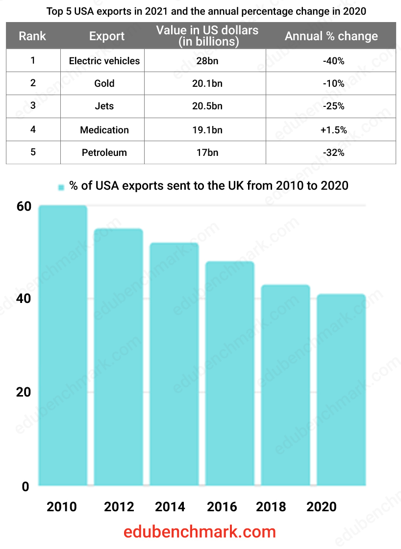
The table below gives information about the USA’s top exports in 2021 and the percentage change with 2020. The bar chart shows the percentage of the USA exports sent to the UK between 2010 and 2020.
Summarise the information by selecting and reporting the main features and make comparisons where relevant.
Write a minimum of 150 words

3. Structure for IELTS Table and Bar Chart Questions
Essentially, you need to follow the same structure as you would for any other writing task 1. This means you need to include an introduction, overview and main body paragraphs. Read on for more details on what to include for each paragraph.
3.1 Introduction
Your introduction should be one or two sentences that paraphrase the given statement, meaning you should write it again in your own words, and describe any other key features of the table and bar chart.
The difference in this combination question compared to a single visual is that you need to introduce both the table and the bar chart in your introduction. You should write two sentences summarising both. Here are some possible ways to start each sentence:
- The table shows
- The bar chart illustrates
As always, you need to paraphrase the statement given in the question in your own words.
Here is an example of a paraphrased statement:
Original statement:
The table below shows the figures for genres of TV programmes watched on a streaming service by country in millions. The bar chart shows the percentage of people watching different streaming services from 2010 to 2020.
Paraphrased statement:
The table compares four countries in terms of the number of people, in millions, who watch four different genres of television programmes (comedy, horror, documentary, and true crime) on a streaming service. The bar chart illustrates the proportion of people that watched programmes via a range of streaming between 2010 and 2020.
Other things to consider when writing your introduction of a table and bar chart:
- You will not be able to change every word when paraphrasing the statement
- Remember to include any dates and units given (e.g £;$;%)
- Brackets are a useful way to refer to categories shown in the table/bar chart, but do not overuse them
- You only need to write 1-2 sentences maximum
- Spend the shortest amount of time on your introduction: move on to your more important overview and body paragraphs
3.2 Overview
Your overview is always the most important paragraph for writing task 1. Without an overview, you will struggle to achieve above a band score 5.0 in Task Achievement.
Always begin your overview in a clear way so it is easy to identify, for example, start with ‘Overall…’
Remember, you need to identify the key trends for both the given IELTS table and bar chart. Do not give too much detail and avoid giving specific figures.
Here’s an example of an overview for a combined table and bar chart question:
Overall, sales of the five highest value USA export sectors declined between 2010 and 2020. Furthermore, the most valuable export from the USA was electric cars and the least valuable was petroleum.
3.3 Main Body Paragraphs
Your main body paragraphs need to provide more detail on the main points you identified on your overview.
You should refer to specific years and figures. You also need to refer to the data clearly and carefully as the examiner will carefully check if you have summarised the data accurately.
Organise your ideas into logical paragraphs, for example:
Main body paragraph 1: Key features of the table
Main body paragraph 2: Key features of the bar chart and any relevant comparisons
4. IELTS Writing Task 1 Band Descriptors Explained
Take a look at our section on IELTS Writing Band descriptors for advice on how to succeed in each band.
5. Vocabulary for IELTS Tables and Bar Charts
5.1 Vocabulary for Tables
When describing a table, you should use comparative words and phrases that compare the information. Make sure to use a range of comparative language to increase your score in Lexical Resource.
Here are some example structures you could use:
… far more popular for ____ than _______.
Twice as many _______ as _____…
A considerably higher number ______ than _____…
______ was slightly higher than that of ______.
Far more ______ than ______….
______ was equally popular for ______ and ______.
5.2 Vocabulary for Bar Charts
You may find that it is difficult to describe the data from a bar chart exactly. To get around this, you can use phrases to approximately describe the data on a bar chart.
The table below shows language to describe data that is not precise:
| Under | Over | About |
|---|---|---|
| Considerably less than | Considerably more than | Approximately |
| Just under | Slightly over | Around |
| Close to | Marginally above | Roughly |
| Slightly under | Well over | Near to |
| Less than | More than | In the region of |
| Almost | Just over | |
| Nearly |
Example sentences:
Petrol cars were considerably less expensive than electric vehicles in 2010.
The price of petrol was well over the price of diesel in 2010.
Petrol was approximately 20% more expensive in 2010 than 2020.
5.3 Language for Change
If you are given data over different time periods, you will need language to describe change for both tables and bar charts.
The table below gives examples of useful verbs, adverbs, adjectives and nouns that can describe change:
| Verb | Adverb | Adjective | Noun |
|---|---|---|---|
| Decline | Considerably | Considerable | Decrease |
| Fall | Sharply | Dramatic | Decline |
| Increase | Dramatically | Gradual | Drop |
| Decrease | Slightly | Rapid | Fall |
| Grow | Steadily | Sharp | Improvement |
| Shoot up | Significantly | Significant | Rise |
| Rise | Gradually | Slight | Fluctuation |
| Go up | Rapidly | Steady | Increase |
6. Grammar for IELTS Writing Task 1 Tables and Bar Charts
6.1 Grammar for Tables
As well as comparative vocabulary, you can also use a range of comparative grammatical structures to increase your score in Grammatical Range and Accuracy.
Examples:
_____ is as _____ as _____
_____ is not as _____ as ______
______ is ______ the price of ______
______ is double the price of ______
______ is the same price as ______
______ is much less expensive than ______
______is slightly less expensive than ______
______ is not quite as expensive as ______
______ is twice/ three times cheaper than ______
Examples:
Petrol is as expensive as diesel in the USA.
Tea is not as cheap as coffee in the UK as in the USA.
Cheese is double the price of bread…
Milk is the same price as tea…
Diesel is much less expensive than petrol…
Gold is slightly less expensive than silver…
Silver is not quite as expensive as gold…
Butter is twice three times cheaper than cheese…
6.2 Grammar for Bar Charts
Here are some comparative and superlative structures you can use when describing bar charts:
- Adjective + -er
- More/less + adjective
- As____ as ____
- The most + adjective
- The least + adjective
- ______ is not as + adjective + as _____
- Three times/ half/ twice as much/less as
- The number of ___is ___ times higher than ___
Examples:
- The price of petroleum was much higher than gold…
- Gold was more expensive than silver…
- Petrol was as expensive as diesel…
- The most expensive export was…
- The least expensive export was…
- Gold was three times more than silver…
- The price of gold was three times higher than silver..
7. IELTS Writing Task 1 Table and Bar Chart Sample Answer
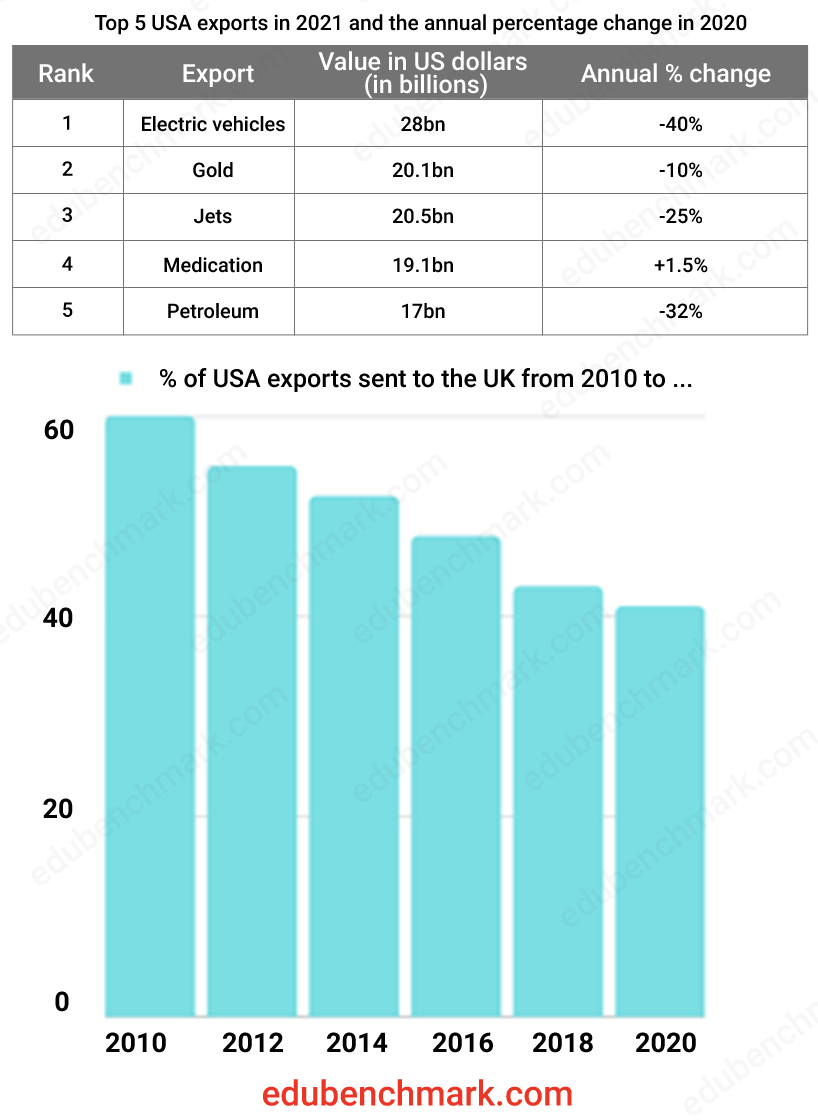
The table below gives information about the USA’s top exports in 2021 and the percentage change with 2020. The bar chart shows the percentage of the USA exports sent to the UK between 2010 and 2020.
Summarise the information by selecting and reporting the main features and make comparisons where relevant.
Write a minimum of 150 words

Sample
The table shows the highest value exports from the USA in 2021 and how these figures changed in comparison with the previous year. The bar chart gives information about the proportion of overall USA exports which were sent to the UK between 2010 and 2020.
Overall, sales of the five highest value USA export sectors declined between 2010 and 2020. Furthermore, the most valuable export from the USA was electric cars and the least valuable was petroleum.
Exports of e-vehicles were still the top export product by overall value in 2021 but still saw a significant fall of 40% to 28bn. Petroleum declined sharply, by almost a third, to 17 bn. Exports of gold and jets fell more gradually and were both valued at just over 20bn. Conversely, overseas sales of medication saw a modest increase of 1.5%.
Exports to the UK as a proportion of the USA’s overall international trade were in steady decline from 2010 to 2020, from a high of 60% to a low of around 40% a decade later in 2020.
7.1 Sample Commentary
The report above would receive an estimated 9.0 overall in the IELTS writing task 1 Academic paper.
The introduction summarises both the table and the bar chart using the phrases ‘the table shows’ and ‘the bar chart gives information about…’. The years of the table/ chart are also provided.
There is an overview that gives the general trends of both the table and the graph. All of the categories have been mentioned and the main body paragraphs refer to the data accurately and refer to dates and units provided. The overview is clearly indicated using ‘Overall…’. and a further feature is introduced with the linking phrase ‘furthermore’.
Vocabulary to describe change has been used effectively in the main body paragraphs, such as ‘declined sharply’, and ‘fell more gradually’.
8. Common Errors and How to Avoid Them
Problem 1
Only writing about either the table or the
Solution 1
You need to write about both the table and the bar chart for this type of combination question to meet the requirements for Task Achievement.
Problem 2
Trying to write about each feature of the table and bar chart
Solution 2
You do not have enough time to write about each feature, and you must also remember that you are being tested on the skill of
9. Quiz- Check Your Understanding
Take this short quiz to test your understanding of writing task 1 combined table and bar charts:


Can you plz help me for my itles exam
Hi Rina, You can use the following services:
IELTS Writing Correction
IELTS Speaking Assessment