

This Academic IELTS guide covers everything you need to know about IELTS pie charts with sample questions designed to understand how to achieve full marks in the IELTS Academic writing task 1.
Table of Contents
- IELTS Pie Chart Overview
- IELTS Task 1 Pie Chart Questions
- Structure for IELTS Pie Chart Questions
- IELTS Writing Task 1 Band Descriptors Explained
- Vocabulary for IELTS Pie Charts
- Grammar for IELTS Writing Task 1 Pie Chart
- IELTS Writing Task 1 Pie Chart Sample Answer
- Common Mistakes and How to Avoid Them
- Quiz- Check Your Understanding
1. IELTS Pie Chart Overview
A pie chart is a circular graph that is divided into sectors. Each sector represents a portion of the whole, usually using percentages. In IELTS writing task 1, you may be given two pie charts from either the same year or different years.
1.1 Objective
The objective of this writing task question type is to produce a report that summarises and compares the key features of the given pie charts.
You should only spend 20 minutes on this task and your report should be at least 150 words (here is our guide on IELTS report length for writing task 1- suggested Academic Writing Task 1 word length
1.2 Skills Used
As with all IELTS writing task 1 questions, including Bar Graph, Line Graph, Table and Flow Chart, you are being tested on your ability to select and summarise the main features of the given charts. With IELTS pie charts, you should always compare the data in both charts where appropriate.
An IELTS report should always be written using a formal register. This means that you should not use informal language and you must not include your opinion… stick to the facts (you will be asked to give your opinion in IELTS writing task 2).
2. IELTS Task 1 Pie Chart Questions
Here are some examples of the types of pie chart questions you might be given:
The pie charts show the main reasons for migration to and from the USA in 2018
Summarise the information by selecting and reporting the main features and make comparisons where relevant.
Write at least 150 words
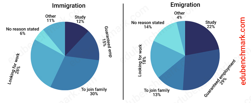

2.2 Pie Charts in Different Years
The pie charts provide data about the 10 most popular university subjects at a New York university in 2000 and 2010.
Summarise the charts by selecting and reporting the main features and make comparisons where relevant.
Write at least 150 words
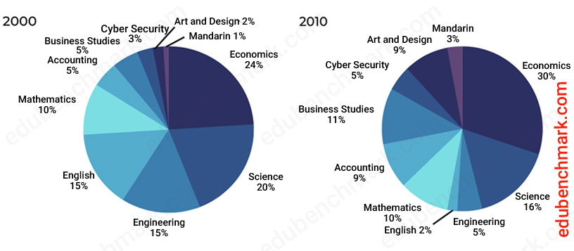

3. Structure for IELTS Pie Chart Questions
As with all other writing task 1 questions (bar charts; line graphs; process diagrams; maps) your report for IELTS pie charts should always include an introduction, an overview and two main body paragraphs.
The next three sections of this guide will go into more detail of what you should include in each paragraph.
3.1 Introduction
All you need to do in your introduction for an IELTS pie chart question is to paraphrase the IELTS statement and anything else the charts show, such as the units given ( e.g. ‘Units are given in pound sterling).
Paraphrasing means that you put the statement in your own words whilst keeping the meaning the same. You can do this in many ways, such as by using synonyms or similar expressions, by changing the word class (e.g. a verb to a noun), or by changing the sentence structure in some way so that the sentence is still grammatically correct (e.g. changing the sentence from the active to the passive voice). You do not have to change every word to paraphrase successfully.
These are some possible ways you could start the introduction of a pie chart:
- The pie chart shows…
- The pie charts give information about…
- The pie charts illustrate…
And here is an example of a paraphrased statement:
Original statement:
The pie charts show a breakdown of the top ten industries in which female and male graduates gained employment in the USA in 2020.
Paraphrased statement:
The pie charts illustrate what percentage of men and women that graduated from an American university in 2020 and found a job in a related industry.
These are the main changes that have been made:
- The pie charts show…
- The pie charts illustrate…
- …which female and male graduates…
- …what percentage of men and women…
- …gained employment…
- …found a job in a related industry…
3.2 Overview
Your overview paragraph of a sample IELTS report is very important as this is where you summarise the main trends (you are looking for about two or three trends) shown in the pie charts. Your overview should be about two or three sentences.
You should not go into detail just yet, you only need to summarise information that shows the highest/lowest proportions in the charts, or biggest changes in the data. There might also be some exceptions to the main trends that stand out.
To make it clear to the examiner that this is your overview, start your first sentence with one of the following:
- Overall,…
- Broadly, it can be seen that..
You may also use “In Summary” or “To summarise” but these are not very common.
To identify the main trends in the charts, consider asking yourself the following questions:
- Which sector was the largest in the given years?
- Which sector was the smallest?
- Did each sector change a lot or a little in the given years?
- Did any sectors increase or decrease over time?
3.3 Main Body Paragraphs
Your two main body paragraphs will go into detail about the key features you highlighted in your overview. You need to refer to the data accurately – always include the units given in the charts (e.g. %). You should also include the years for each sector you are describing.
Organise your main body paragraphs logically. For instance, one paragraph could focus on the first chart, and the second paragraph on the second chart. Make sure to include some comparisons between the charts.
It is also important that you use the correct tense, for example:
- Pie chart in the past: The proportion of energy produced by solar was 20% in 2010.
- Pie chart in the future: The proportion of energy produced by solar will increase by 50% by 2050.
4. IELTS Writing Task 1 Band Descriptors Explained
Our section on IELTS Writing Band descriptors gives you all the information you need for IELTS Academic writing task 1.
5. Vocabulary for IELTS Pie Charts
5.1 Vocabulary for Ratios
You can use a range of languages to rank the largest and smallest percentages. Here are some examples:
| Vocabulary | Example |
|---|---|
| Least popular | The least popular sport chosen by men was swimming, at 10% |
| Highest | The sector with the highest percentage of sport chosen by women was hockey, at 50% |
| Third place | Yoga was in third place with 12% |
| Bottom | Baseball was ranked bottom, at 5% |
| Ranked second | Rugby was ranked second, at 16% |
| Equally | Baseball and basketball were equally popular, at 25% |
| Most | The most popular sport overall was football, at 55% |
| Followed | The most popular sport overall was football, at 55%, followed by rugby at 30% |
| Came top | Football came top of the chart for women, with 20% |
5.2 Percentages
The following phrases are useful when writing about percentages of a certain sector (football is the example sector here):
- Football made up 55% of sports chosen by men in 2010.
- Football accounted for 55% of sports chosen.
- Football comprised 55% of all chosen sports.
5.3 Expressing Percentages with Similar Phrases
To avoid repetition, you can express percentages from the pie charts using different phrases whilst maintaining the same meaning.
See the examples below:
| Percentage | Similar Phrase |
|---|---|
| 10 % | A tenth/ one in ten |
| 20% | A fifth/ one in five |
| 25% | A quarter/ one in four |
| 33% | A third/ one in three |
| 50% | A half/ half/ one in two |
| 66% | Two-thirds |
| 75% | Three-quarters |
6. Grammar for IELTS Writing Task 1 Pie Chart
6.1 Tenses for IELTS Pie Charts
You need to determine the date(s) of your pie charts so that you use the correct tense. To do this, follow the tips below:
- Identify if the given year is before the present year (2022 at the time of writing)
- If the year is before the present (e.g. 2000), you need to use the past tense throughout your report
- If the year is after the present year (e.g. 2050), you need to use the future tense
- If there is no year, you should use the present simple tense
Whatever the year, you can still start your body paragraph with the present simple tense and then switch to the past or future, for example:
The data shows that between 2000 and 2010, there was a significant drop in the number of graduates.
It is evident that in 2050 there will be a huge rise in the number of graduates.
7. IELTS Writing Task 1 Pie Chart Sample Answer
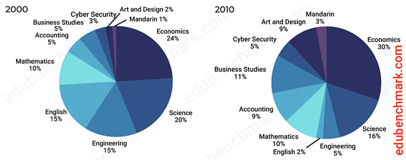
The pie charts provide data about the 10 most popular university subjects at a New York university in 2000 and 2010.
Summarise the charts by selecting and reporting the main features and make comparisons where relevant.
Write at least 150 words

Sample
The pie charts show information about the percentage of people who studied ten selected university subjects at a university in New York between 2000 and 2010.
Overall, what stands out from the pie charts is that the most popular subject in both 2000 and 2010 was economics. Another interesting point is that the biggest change was relating to English, which fell dramatically over the decade.
If we look at 2000, economics was considerably more popular than science, with figures of 24% and 20% respectively. Engineering and English were equally popular at 15%. Twice as many people studied mathematics as accounting, with the former being 10% and the latter 5%. Finally, a slightly larger percentage of people studied art and design (2%) than Mandarin (1%).
Regarding the changes in 2010, economics went up slightly from 24% to 30%. By contrast, the number of science students dropped slightly from 20% to 16% in 2010. Mathematics stayed the same percentage in both years at 10%. Finally, in 2000, 15% of students studied English; but by 2010 the figure fell dramatically to just 2%.
7.1 Sample Answer Commentary
The report above would receive an estimated 9.0 overall in the IELTS writing task 1 Academic paper.
It has been organised into four logical paragraphs that are clearly divided into an introduction, overview, and two separate body paragraphs. The minimum 150 word count has been exceeded. The report is written in a formal style (the writer has not included their opinion and has not used informal language). All the figures have been referred to accurately.
The overview paragraph has been clearly signposted using ‘overall’ and the introductory phrase ‘what stands out from the pie charts is that…’ The overview describes the main trends of the line charts and does not include any specific figures. It generally describes the biggest and most dramatic change.
The dates of the pie charts have been referred to accurately and the past tense has been used correctly throughout the report.
Language to describe ratios and percentages has been used throughout the report e.g.,’ Engineering and English were equally popular at 15%’.
Comparisons between both years have been made in the second main body paragraph ‘Mathematics stayed the same percentage in both years at 10%’.
Linking phrases have been used appropriately, e.g. ‘if we look at’ and ‘finally. Words such as ‘former’ ‘latter’ and ‘respectively’ have been used to refer to the data accurately.
8. Common Errors and How to Avoid Them
Problem 1
Using the past tense when the future tense is required.
Solution 1
Since it is not common to have a chart with predicted future data, candidates often use the incorrect tense. If a pie chart is from a date in the future (after the time of writing) e.g. 2050, then you will need to use future forms to summarise the data. For example, In 2050, it is predicted that 15% of students will study Art and Design.
Problem 2
Including detailed facts and figures in the overview
Solution 2
You do not need to include facts and figures in your overview. You should instead use general descriptions of the most noticeable figures (the biggest/smallest/largest difference) and save the detail for your main body paragraphs.
9. Quiz- Check Your Understanding
Take this short quiz to test your understanding of writing task 1 and pie charts:


Dear Liz thanks for this essential website. it is really useful to read and learn about the IELTS test. I have one suggestion. could you please add more practice tests to the website so that candidates can practice more and get benefits out of it?