
This IELTS Academic Writing guide covers everything you need to know about IELTS writing task 1 combination bar chart and pie chart questions. Read on for example questions, sample answers and much more!
Table of Contents
- IELTS Bar Chart and Pie Chart Overview
- IELTS Task 1 Combined Bar Chart and Pie Chart Questions
- Structure for IELTS Bar Chart and Pie Chart Questions
- IELTS Writing Task 1 Band Descriptors Explained
- Vocabulary for IELTS Bar Chart and Pie Charts
- Grammar for IELTS Writing Task 1 Bar Chart and Pie Chart
- IELTS Writing Task 1 Bar Chart and Pie Chart Sample Answer
- Common Mistakes and How to Avoid Them
- Quiz- Check Your Understanding
1. IELTS Bar Chart and Pie Chart Overview
You may be given both a bar chart and pie chart to summarise and compare in an IELTS writing task 1 question.
1.1 Objective
The objective of this task is the same for every writing task 1 question: produce a 150-word formal report that summarises and compares the most important features you see in both the bar chart and pie chart.
1.2 Skills Used
This part of this exam will test your ability to:
- Identify key features from a bar and pie chart
- Summarise the key features
- Make comparisons between the data where relevant
2. IELTS Task 1 Bar Chart and Pie Chart Question
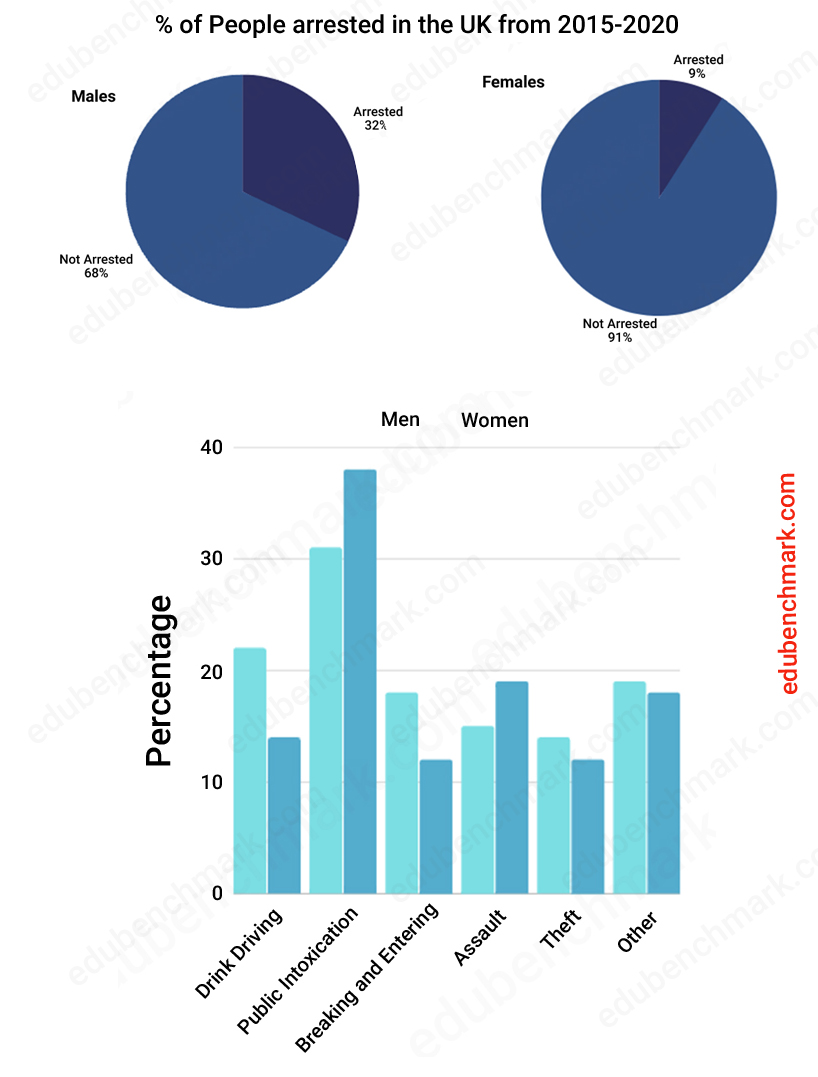
The pie chart shows the percentage of males and females arrested in the UK from 2015-2020 and the bar chart shows the reasons for these people’s arrest.
Summarise the information by selecting and reporting the main features and make comparisons where relevant.
Write a minimum of 150 words


3. Structure for IELTS Bar Chart and Pie Chart Questions
Follow the advice below to write a successful introduction, overview and two main body paragraphs for this question type.
3.1 Introduction
You need to paraphrase the given statement and write it in your own words. The difference with a combination question and a single source question is that you need two sentences to introduce both visuals. Here are possible ways to introduce both a bar chart and pie chart:
- The bar chart gives information about…
- The pie chart shows…
Here is an example of a paraphrased statement, can you identify the main changes?
Original statement:
The pie chart shows the percentage of males and females arrested in the UK from 2015-2020 and the bar chart shows the reasons for these people’s arrest.
Paraphrased statement:
The pie chart gives information about the number of men and women arrested over a five-year period from 2015-2020 while the bar graph details the reasons for their arrest.
3.2 Overview
Your overview needs to identify the key features and trends of both the bar chart and pie chart.
You should signal your overview using the linking phrase ‘Overall…’ and you should avoid presenting details at this stage.
Aim to identify 4-6 key features to introduce in your overview. Use general language to describe the overall trends from both the bar and pie chart by asking yourself: What are the highest numbers? What are the lowest numbers? What happened over time? What are the largest differences?
3.3 Main Body Paragraphs
You need to create a clear and logical structure to your main body paragraphs that is easy for the examiner to follow. Consider this example:
Main Body Paragraph 1– The main features of the bar chart
Main body paragraph 2– The main features of the pie chart and any relevant comparisons
You should go into more detail about each key feature you mentioned in your overview. Do not try and write about every feature as you are being tested on your ability to summarise the main features.
Read on for useful vocabulary and grammar that you can use in your body paragraphs.
4. IELTS Writing Task 1 Band Descriptors Explained
Check out our section on IELTS Writing Band descriptors in our IELTS writing Task 1 Masterclass for helpful hints.
5. Vocabulary for IELTS Bar Charts and Pie Charts
5.1 Vocabulary for Bar Charts
When you cannot exactly determine a figure on a bar chart, you can use language to approximate:
Under: Considerably less than; Just under; Close to; Slightly under; Less than; Almost; Nearly
Over: Considerably more than; Slightly over; Marginally above; Well over; More than; Just over
About: Approximately; Around; Roughly; Near to; In the region of
5.2 Vocabulary for Pie Charts
Here is some useful language to use when describing pie charts:
- ____ was the least popular ____
- ____was the highest ____
- ____ was in first/second/third place…
- ____ was ranked bottom…
- ____ was ranked second…
- ____ was equally popular…
- The most popular was ____ followed by ____
- ____ came top at ____
- ____ was 55%…
- ____ made up 55%…
- ____ accounted for 55%…
- ____comprised 55% (of the entire chart)
6. Grammar for IELTS Writing Task 1 Bar Charts and Pie Charts
6.1 Grammar for Bar Charts
Comparative and superlative forms are very useful when describing bar charts. For example:
- Football was as popular as rugby
- Rugby was more popular than softball
- Swimming was the most popular sport
You can also use the words below to modify comparative forms and make then more accurate:
- much
- a lot
- slightly
- a bit
- Considerably
Examples:
- Rugby was considerably more popular than baseball.
- Swimming was slightly more popular than golf.
6.2 Grammar for Pie Charts
You need to be accurate when choosing the tense to describe the data from pie charts. Follow the advice below to determine if you need the past, present or future tense:
- Is the pie chart year before or after the present day? If yes, then you will mainly need the past tense
- Is the year after the present day? If so, you need to use the future tense
- Is there no year given? In this case, you should use the present simple tense
It is acceptable to start a sentence with the present simple tense and then switch to the past or future, for example:
The data shows that between 2000 and 2010, there was a significant drop in the number of graduates.
7. IELTS Writing Task 1 Bar Chart and Pie Chart Sample Answer
The pie chart shows the percentage of males and females arrested in the UK from 2015-2020 and the bar chart shows the reasons for these people’s arrest.
Summarise the information by selecting and reporting the main features and make comparisons where relevant.
Write a minimum of 150 words


Sample
The pie chart gives information about the number of men and women arrested over a five-year period from 2015-2020 while the bar graph details the reasons for their arrest.
Overall, it can be seen from the pie chart that the number of men arrested was higher than that of women over the given period. Furthermore, drinking in public was the major reason for arrests over 5 years while the lowest reason was theft for both genders.
In detail, the pie charts show that of the 41% of people arrested, 32% were male and just 9% were female. Regarding male arrests, public intoxication was the highest reason for arrest at just over 30% opposed to theft which was the lowest coming in at about 14%. The second highest reason for arrest was drink driving at slightly over 25% while the remaining reasons all ranged between 10% and 20%.
Similarly, the most common reason for females’ arrest was also public intoxication which peaked at just over 30%. Furthermore, assault was the second most common reason for female arrest at just under 20%. The percentage of women committing theft was almost as high as breaking and entering with both reaching just over 10%.
7.1 Sample Answer Commentary
The report above would receive an estimated 9.0 overall in the IELTS writing task 1 Academic paper.
It has been organised into four logical paragraphs that are clearly divided into an introduction, overview, and two separate body paragraphs. The minimum 150 word count has been exceeded. The report is written in a formal style (the writer has not included their opinion and has not used informal language).
The overview paragraph summarises the key features of both the bar and pie chart.
Linking words like ‘overall’, ‘in detail’ and ‘furthermore’ have been used to create cohesion in the report.
The data has been referred to accurately throughout and language has been used to talk about percentages e.g. ‘just over 30%’, ‘coming in at about 14%’, and ‘reaching just over 10%’.
8. Common Errors and How to Avoid Them
8.1 Problem 1
Problem
Not including both the bar chart and pie chart in the overview.
Solution
You need to dedicate at least one sentence to both the bar chart and pie chart in your overview.
8.2 Problem 2
Problem
Reading the data incorrectly and giving inaccurate figures.
Solution
Practice by looking at model essays for these question types and then finding the figures on the charts. Always give yourself a few minutes to read through your report and check if the figures are accurate.
9. Quiz- Check Your Understanding
Take this short quiz to test your understanding of writing task 1 and tables:


